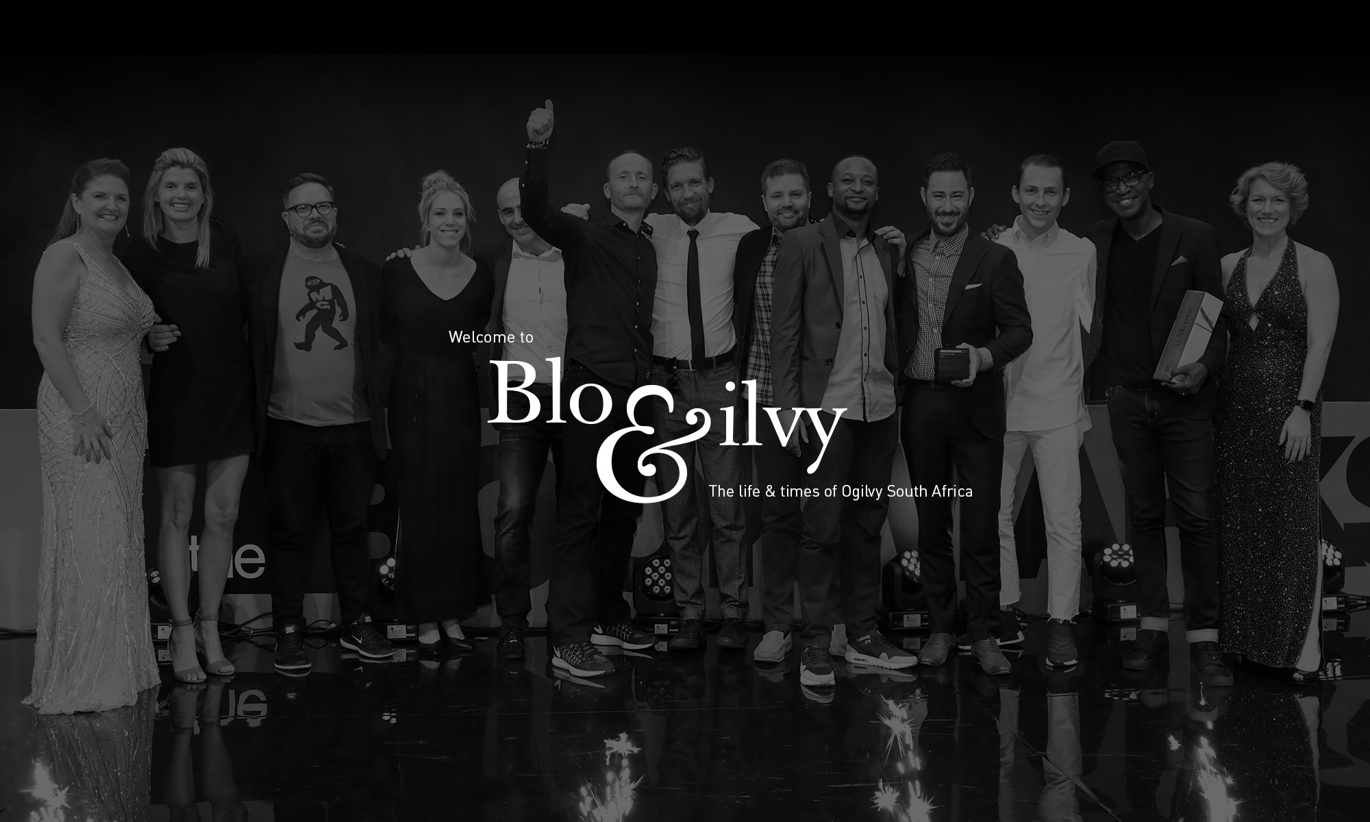
Written by Rob Hill, Chief Operations Officer, Ogilvy & Mather SA.
Why did David Ogilvy choose red, not blue or black or any other hue when he started Ogilvy? Is red a message about the kind of agency he wanted to build? Is the colour red a thread of DNA that he chose to shape his company?
There is no doubt that David Ogilvy never did much without research. He spent his formative years in advertising as a Gallup researcher. He left us with many instructions to do our homework. “Advertising people who ignore research are as dangerous as generals who ignore decodes of enemy signals,” he said.
So if David was as diligent as we know him to be and if he chose red specifically, it’s clear that he wanted to build a company that was ‘red by design’.
But what was it that David discovered about red that convinced him it was the right colour for his new company? This is especially curious given that in those days (post-war 1948), red wasn’t a fashionable colour. In fact it might have been a statement against fashion. According to Vogue archives, in the late 40’s, navy blue was the colour du jour.
If we do our research as David urges and try to understand his thought process, we find that red is a colour that is hot-wired into our subconscious with a range of symbolic, visual, psychological and physical meanings.
Red = Winning
British anthropologists Russell Hill and Robert Barton of the University of Durham reached the conclusion that when opponents of a game are equally matched, the team dressed in red is more likely to win. Their research is based on a study of the outcomes of one-on-one boxing and freestyle wrestling matches at the Olympics.
“Where there was a large point difference — presumably because one contestant was far superior to the other — colour had no effect on the outcome,” Barton said. “Where there was a small point difference, the effect of colour was sufficient to tip the balance.”
In equally matched bouts, the preponderance of red wins was significant enough that it could not be attributed to chance, the anthropologists say. Hill and Barton found similar results in a review of the colours worn at the Euro 2004 international soccer tournament.
Red = Breakthrough
There is no doubt that David would have considered the science of red. He would perhaps have known that red, a primary colour and the first to emerge from infrared, is the hue that first strikes the eye and so has an extremely high impact. (This explains why it denotes “stop” in stop signs, brake lights and robots. Sir Giles Scott specifically chose red for the telephone box so it would be easy to spot).
Red, therefore, is the most breakthrough colour. No doubt this fact would have appealed to David.
Red = Risk
The expression “paint the town red” is said to date back to 1837 when the Marquis of Waterford and a group of friends ran riot in the town of Melton Mowbray, painting several buildings red.
Red is never safe. It is not a colour associated with the ordinary and everyday. It excites and energises.
Red signifies danger. It is commonly the colour of the fire fighting profession. Red indicates extreme danger on Western colour-coded scales. There is no middle ground with red. It is not the colour of average; it is the colour of extremes – cupid and the devil.
So risk is red. Red isn’t safe or comforting. It pushes us into the danger zone.
Red = Passion
Red is the colour most associated with human emotion. The human heart is red and in our business, as we know, the heart always trumps the head. Perhaps this is why red is the most passionate of colours, associated with love, courting and romance.
It is well-known that red evokes more passion. Red teams appear to have more fans around the world than blue teams. Even passionate language is described using red as a metaphor. In décor and interior design, red is a passion colour.
Red is a popular choice in high-energy areas such as business foyers. The phrase “red-blooded” describes someone who is passionate, robust and virile. Red isn’t always well-behaved. Red is unruly.
Red is associated with speed and agility and so it’s fitting that it should be the traditional colour of Italian racing cars. Ferrari’s red originated in the way the sport began, where each country was assigned a colour. Red was assigned to Italian cars, Green to English, Blue to France and so on.
Red = Attack
In Roman mythology, red was associated with the god of war, Mars, and the reddish planet was named after him.
Red is idealistic and denotes bravery. The first time red was used as a symbol for revolutionary struggle was during The French Revolution at the end of the eighteenth century. Yet it was in Russia that the colour acquired its specific reference to liberation and new beginnings. Russian revolutionary ideology began to actively exploit the colour, combining in it the symbolism of blood, triumph, victory, hope and faith.
 Red was the colour of the Roman Empire. It has been said that Roman officers would wear red so that if they were wounded, it would not discourage their troops nearby. The tradition of wearing red was carried though by the British Red Coats.
When the British tried to colonise Africa, the Masai were one of the tribes that fiercely fought back. These African warriors wear red kangas and kikois, which represent power.
Red = Rare
Many painters have exhibited a fascination with red hair, possibly for the mystique it holds as an uncommon hair colour among humans. At most, two percent of the human race is redheaded.
Gustav Klimt explored red often in his work and Sandro Boticelli’s famous painting, The Birth of Venus, depicts the mythological goddess, Venus, as a redhead. There is little doubt that the red hood makes Little Red Riding Hood an infinitely more menacing and memorable story.
Red = Maverick
Red is also the colour we often associate with rebels, mavericks and round pegs in square holes. Karl Marx was possibly the world’s most famous red rebel. Richard Branson and his Virgin brand is another red maverick. Che Guevara, the revolutionary icon, also used red to signal his stance.
Red is also the colour of fame. This dates back to the time of Jahangir, the Mughal emperor from 1605 to 1627. It is said that he once paid a visit to his brother-in-law on New Year’s Day. To celebrate the event, his host carpeted the road between his house and the palace in rich velvets, so that the royal entourage would not have to touch the ground.
Hence the red carpet.
So in summary red, as the research shows, means: always active; always exciting; full of human emotion; high impact; always attracting attention; never safe; full of passion; not confined by rules; committed to society and a social conscience; agile and fast; always on the attack; brave; idealistic; mysterious; hot; winning, and most associated with selling.
So if this is what red is all about, it sounds like David Ogilvy set out to build an extremely exciting and passionate company, a company full of rebels and mavericks.
In 1948, when he made this choice, he wanted to stand out against the prevailing trends and set the tone for his new company. When he developed his red identity he set out to build a company with a uniquely challenging and creative culture.
I suppose the key question for us at Ogilvy today, some 60 years later, is do we live up to red? Are we as passionate, brave, rebellious, idealistic and breakthrough as our DNA demands? Are we on the attack? Do we move beyond safe? Do we evoke strong emotions? Are we agile? Is selling still central?
At our best, I believe we continue to be Red to the core.
We chose a true red find, our Ogilvy Graduate, Michael Stopforth, to design the marvellous infographic below to accompany Rob’s article. Enjoy.